用border生成三角形的@mixin:
// triangle@mixin triangle($direction, $size, $borderColor ) { content:""; height: 0; width: 0; @if $direction == top { border-bottom:$size solid $borderColor; border-left:$size dashed transparent; border-right:$size dashed transparent; } @else if $direction == right { border-left:$size solid $borderColor; border-top:$size dashed transparent; border-bottom:$size dashed transparent; } @else if $direction == bottom { border-top:$size solid $borderColor; border-left:$size dashed transparent; border-right:$size dashed transparent; } @else if $direction == left { border-right:$size solid $borderColor; border-top:$size dashed transparent; border-bottom:$size dashed transparent; }} 这个@mixin主要有三个变量:第一个是方向的,因为三角形根据箭头朝向有四种方向,我们对应常用的css属性top,right,bottom,left;第二个表示三角形的大小;第三个表示颜色。当然你可以挑你常用的那个设置为变量的默认值,那样调用常用的那个就比较简单了,直接 triangle;就ok了。
编译之后的css代码:
/* line 192, ../sass/test1.scss */.top { content: ""; height: 0; width: 0; border-bottom: 20px solid #322222; border-left: 20px dashed transparent; border-right: 20px dashed transparent;}/* line 195, ../sass/test1.scss */.bottom { content: ""; height: 0; width: 0; border-top: 20px solid #322222; border-left: 20px dashed transparent; border-right: 20px dashed transparent;}/* line 198, ../sass/test1.scss */.left { content: ""; height: 0; width: 0; border-right: 20px solid #322222; border-top: 20px dashed transparent; border-bottom: 20px dashed transparent;}/* line 201, ../sass/test1.scss */.right { content: ""; height: 0; width: 0; border-left: 20px solid #322222; border-top: 20px dashed transparent; border-bottom: 20px dashed transparent;} 页面html代码:
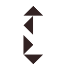
效果: